One of my first few jobs after graduating was in Sales, Marketing and Trade Marketing. As much as it probably means supermarket or mall hopping on the outside or driving all day, it also meant doing things such as:
1. visiting supermarkets via the back door entrance along with boxes and boxes of goods 2. checking stocks in the actual selling area and their warehouse and making sure that my products are complete
3. fixing bottles, cans or wrappers so that brand can easily be read
(The last one was a funny habit I carried over years after I left the corporate world. I would find myself making sure all the labels faced me in our ref at home. Haha.)

There’s so much that goes on behind-the-scenes to make your shopping experience seamless. Not just how the products are arranged but how fresh they are, how much of each product is stocked, what kind of product, what promotions you might enjoy and the like.
![]() There was a time when I found myself taking down notes inside an empty supermarket that has yet to open measuring all the posts and shelves where my files were supposed to be mounted. Looking back, I also remember putting together a planogram & merchandising guideline (a handbook on how products should be handles & arranged) and conducting workshops about it too! *OMG. I just realized now what my first few actual workshops were: chocolate tasting & merchandising workshops. Haha. Fun times.*
There was a time when I found myself taking down notes inside an empty supermarket that has yet to open measuring all the posts and shelves where my files were supposed to be mounted. Looking back, I also remember putting together a planogram & merchandising guideline (a handbook on how products should be handles & arranged) and conducting workshops about it too! *OMG. I just realized now what my first few actual workshops were: chocolate tasting & merchandising workshops. Haha. Fun times.*

OMG. Where am I going with this post, you might ask? I just wanted to say that’s why supermarkets are dear to me and why this project is extra special. 🙂 Aside from the fact that we held some brush lettering workshops with Rustan’s Supermarket, their staff were also the kindest to me when I was pregnant & busy buying supplies. They even offered me a seat while I paid for my items. 🙂 Rustan’s is also my go-to place before and after my workout: grabbing a some bananas, veggies, yoghurt for Riley and oh some chocolates too. *Oops. Hahaha.*
![]()
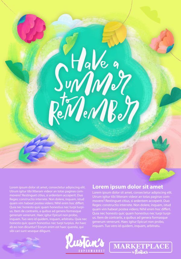
The supermarket has its dynamic process so does design. We often see the final output but instead of going through the details of the process as with my previous posts, I just wanted you to subtly enjoy the changes in the color scheme.

Here’s a look at the design in its early stage. Hihi. I was initially asked to create a design that will compliment the background that they already have below. I’m happy how the design was somehow made its way to backdrop like they’re just family. 🙂
I’m often asked what my favorite colors are. Well, I can’t really choose. I love all of them and I’m afraid one of them might get jealous if I declared a favorite. 😛 😀
 I’m just super stoked and thankful to have seen my design incorporated into Rustan’s summer campaign. This shot was taken in the UPTown BGC branch.

I can’t wait to visit the rest of the Rustan’s branches (because they also have an ongoing summer sale this weekend).
Visit a branch today and I will be forever grateful if you can tag @googlygooeys on Twitter, IG stories or Facebook if you see our work! 🙂
Get the latest news and recipes here:
Website: RustansFresh.com
Rustan’s Supermarket Branches: RustansFresh.com/Our-Stores
Twitter: @RustansFresh
Facebook: @RustansFresh
Instagram: @RustansFresh
Thanks again for this design opportunity Rustan’s & see you cardholders in one of the upcoming workshops.
Have a summer to remember!
In behalf of the Googly Family,
Tippy 🙂
Related Posts:
Rustan’s Supermarket Workshop in Cebu
Ayala Malls Christmas Paper Bags


Awww so proud of you Tippy! I love the color scheme so much. I’m tempted to march to a Rustan’s supermarket and ask for one of those posters/vinyl prints once their summer promo is over. Hihi.
Lol. Haha. Thanks for always being there Anne!
I did this with one of the events. I took home the poster as a remembrance. *Woops*
We apparently think alike. Haha.
See you around!