Hello everyone!
As you may have noticed, we’ve already implemented the new color scheme on our website as well as on our social networking sites. You see, every year, we always want to bring something new into the blog. As you may have seen on our Instagram, we have already ventured into photography, illustration, lay-out & styling. Also, early this year, we tried coming up with short animations that we can show to you on Instagram. We’ve also been trying to set up our baby Vine account. Yup. Every year, we always think of something that would entertain & enrich our readers’ experience.
A couple of months ago, we gave the site a good look and we realized that colorful sites are a thing of the past. Dramatic filters and minimalism are the way to go. Also, we just realized how harsh we have been to you during the past years exposing your eyes to different colors and destroying it slowly in the process. Our apologies in advance to all those who already needed to wear a pair of glasses or contact lenses thanks or no thanks to the fact that you’ve been forced to read the blog by the feind that pointed you to this site to destroy your vision. I’m sorry that we are unable to reimburse you with your medical expenses but we are taking measures to stop this from happening to our readers in the future.
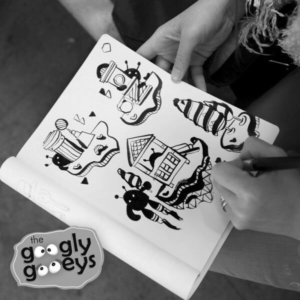
So, now, we’re glad to announce that from hereon, the Googly Gooeys will be in monochrome. We love black and white and we can’t wait to explore the possibilities! Don’t you just love it?❤ From now on, we will be focusing more on the form, the shapes, the textures & the shades. No more over-the-top-what-the-heck-did-you-really-have-to-fill-all-the-free-space-with-some-sort-of-shape lay-outs and distracting why-are-you-so-happy-all-the-time bright colors. No more rainbow default color scheme as well.

We understand that it takes some getting used to so feel free to browse all our social networking accounts. But we can attest that once you go black (and white!) you’ll never go back 🙂
We’ve also put together some of our favorite photos in monochrome to wean your eyes into to our new look. Breathe in, breathe out & take it all in!

Above: And oh, all our blog photos will also be in black & white. How else can you appreciate the steam coming from the cup of coffee if your eyes are too busy being distracted by a brightly colored table or a happy-sappy pastel-colored paper cup, right?

Above: Why spend so much time on picking a palette when you can just concentrate on the line work? Nothing says “bold & crisp” like black & white photos.

Above: Finally, of course all vintage elements are better shot in black & white. They’re more charming that way. (This was taken from the Central District during our recent trip to Hong Kong.)
I really can’t wait to blog more in this grayscale mode! Just imagine: no more extra time spent on choosing colors! With that, we’ll be increasing our efficiency & we will be able to churn out more posts! Yeahhh!
XOXO,
Ms. Excited and Ironically Melodramatic Electron Tipsy ❤


April fools’ Day to you too Tipsy and Ponggo. You almost got me there. Lol. And that steaming coffee really does look great in monochrome.
What April fool’s? Monochrome is here to stay forevahhhhh…
i prefer colourful version. we human beings are blessed for not having monochromatic vision. so before i go blind, let me be grateful with what my eyes can see in colours…
Did you feel like a dog looking at the site? 🙂
The worst is almost over 😀